In this post, we will consider analyzing the Arabic hashtag ![]() with NodeXL. If you’re searching for a Latin string or hashtag, go directly to step 3.
with NodeXL. If you’re searching for a Latin string or hashtag, go directly to step 3.
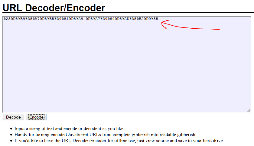
1- On some computers, searching for an non-Latin string may cause NodeXL to return a null result. The safest option is to convert the Arabic string to URL code. Several websites offer a conversion tool. Look for “URL encode decode” on Google. We will use the following website: http://meyerweb.com/eric/tools/dencoder/.
2- type the hashtag in the text box and press “encode” then copy the resulting code:
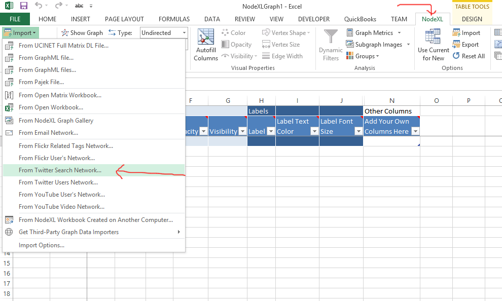
3- Open NodeXL and select “import from Twitter search network”:
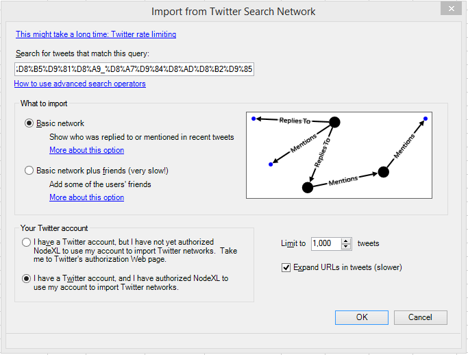
4- Paste the code from step 2 in the search box. You may want to limit the number of tweets (in this example, we limited the number of tweets to 1,000). Note that you may need authorize NodeXL to use your twitter account if this is your first Twitter analysis.
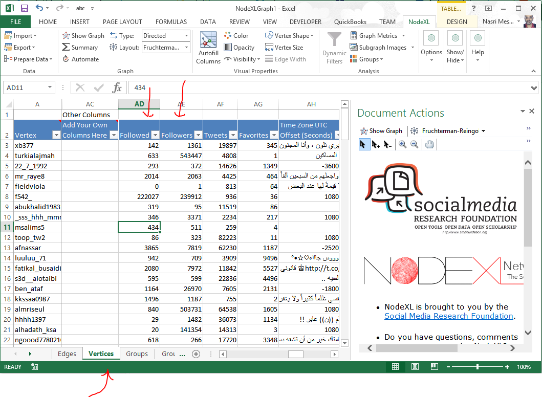
5- The worksheet is automatically filled after the search. In the vertices sheet, you can check the names of the tweeters and some useful information about their popularity (followers) that can be combined with other data in your analysis:
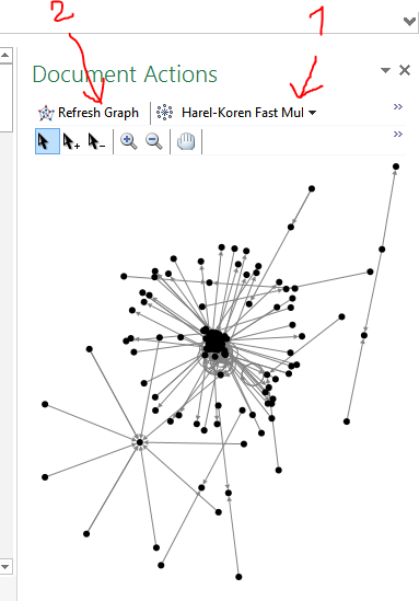
6- Choose the “Harel-Koren” algorithm and “show graph”:
In its current state, the graph doesn’t say much. Yet, it can give you an idea of the structure of the network and you can mouse-over the vertices to read the tweets and the mentions. We will improve the layout in the next steps.
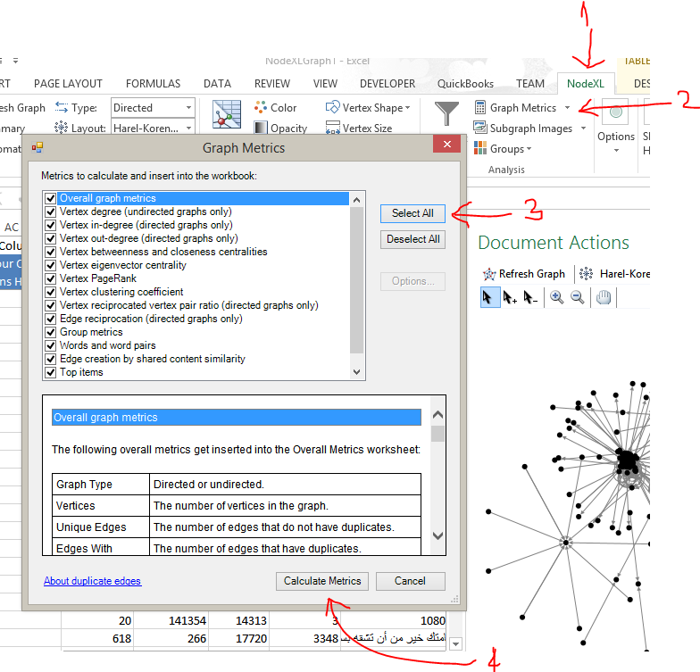
7- In the NodeXL ribbon tab, click on “Graph Metrics”. Then, “Select All” and “Calculate Metrics”.
8- The data compiled can be used to analyze the network and its characteristics (outside the scope of this article which is limited to retrieval and display). Note, that in the vertices sheet, the “in degree” represents the number of times the tweeter was mentioned and the “out degree” the number of times he mentioned someone else. 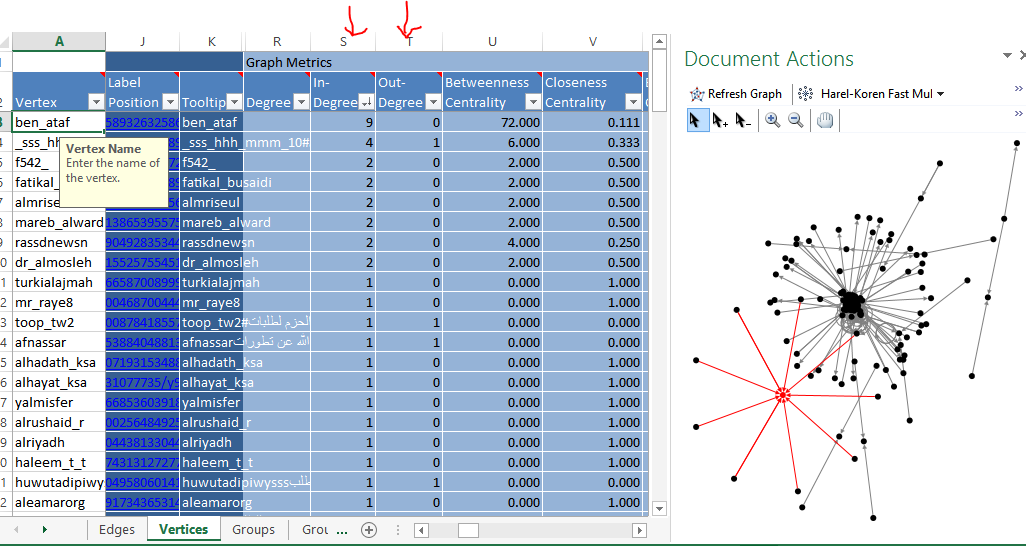
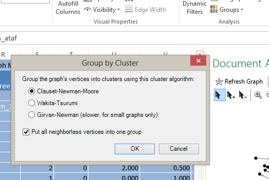
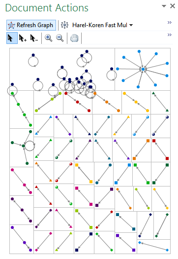
9- In this step, we will group the vertices into clusters. In the NodeXL tab on the ribbon, click on “groups”, “group by clusters” and put neighbourless in one group to avoid having all your singletons displayed as a stand alone group:
Note the Groups and Group Vertices worksheets.
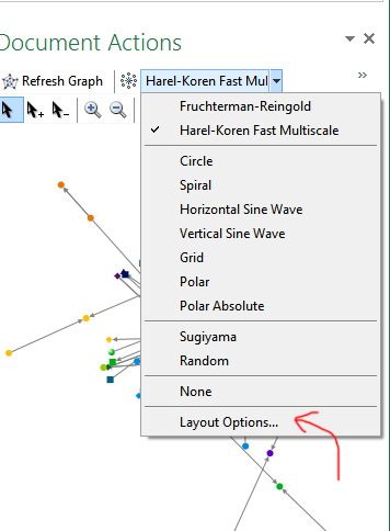
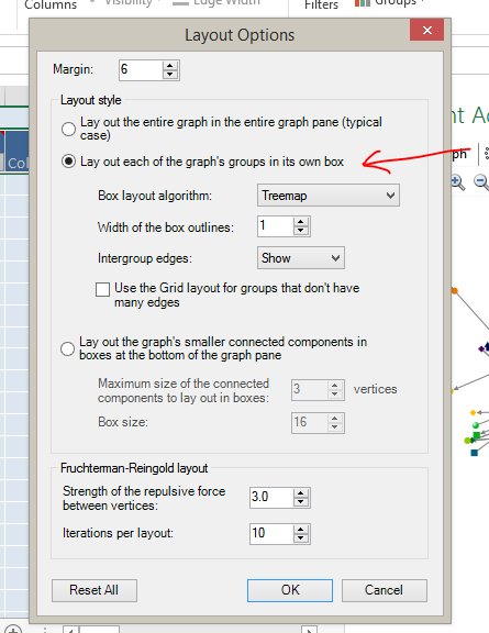
10- In the layout algorithm dropdown, select “layout options” and “layout groups…”
11- The resulting graph show small independent clusters with no interaction between each other. Note the singletons in the first group (people who were never mentioned). Check the following article for details about twitter network structures: http://www.smrfoundation.org/2014/03/02/6-kinds-of-twitter-social-media-network-structures/
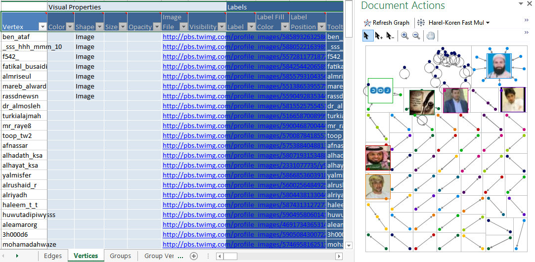
12- To display images instead of dots, in the vertices sheet, select “image” in the shape column, go to the NodeXL tab in the ribbon, select group, group options and check “the shapes specified in the shape column….” to use the shapes defined in vertices sheet instead of those defined in the Group Vertices sheet (this also works for colors).
Note the size and opacity options you can also use to improve the layout.
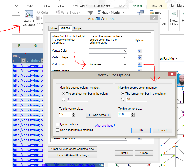
13- The Autofill option allows you to quickly fill a column to modify the layout of your graph (note that you need to refresh the graph to see the results). Try to change the shape, opacity, etc.
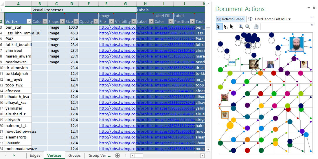
In this screenshot, the size varies from 1.5 to 100 depending on the in-degree (number of times the user was mentioned):
14- To ungroup the vertices, select layout options from the algorithm dropdown in the graph and select “layout entire graph” instead of group… (see step 10)
15- to save the graph as an image, right-click on it and select “save to image”
16- to share your work with others (optional), choose “export to NodeXL Gallery” from the NodeXL tab in the ribbon
Articles and videos to watch and read:
– About Twitter Network structures: http://www.smrfoundation.org/2014/03/02/6-kinds-of-twitter-social-media-network-structures/
– About social networks, mapping and measuring Connections: https://www.youtube.com/watch?v=b5RonanIOF8#t=26
– A walkthrough to using NodeXL to visualize twitter networks: https://www.youtube.com/watch?v=PC-PgkhpsNc
